


On Tuesday last week, I had the amazing chance to present one of my projects at the first Tableau Public Summer Meetup here in London, together with Pablo and coach Andy.
I was really excited, as it was my first time presenting my work outside the Data School!
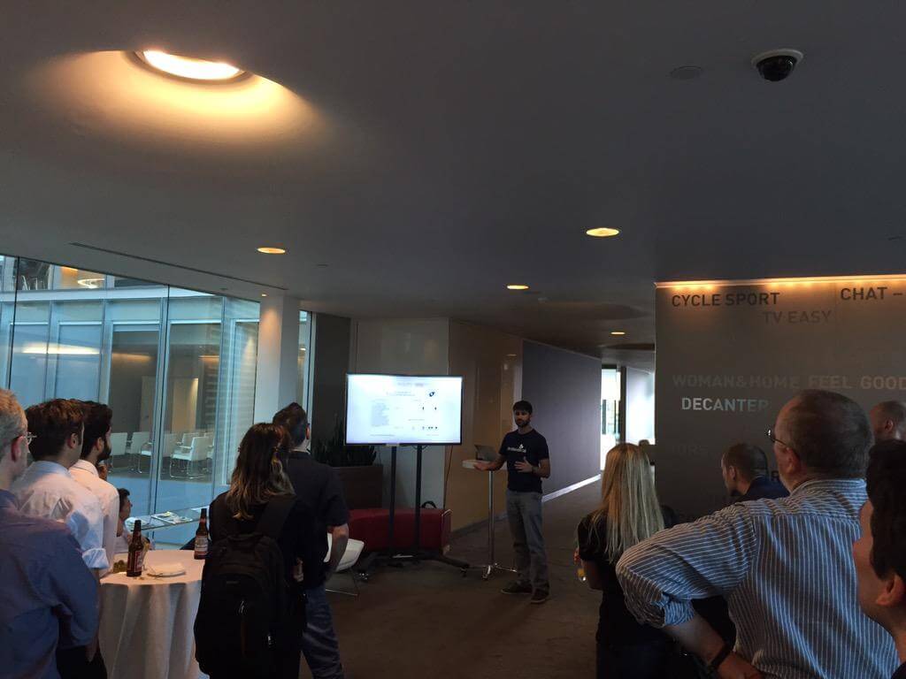
My presentation at the Tableau Public Meetup!
This experience was extremely useful for understanding my strengths and weaknesses regarding my presentation skills, for gathering valuable feedbacks and advices on my work, and for strengthening my relationship with the Tableau Community based in London.
I chose to present the Dashboard on Education Inequality I made as my second project in the school, as it integrates a lot of the techniques I managed to learn in just two weeks, thanks to our coaches.
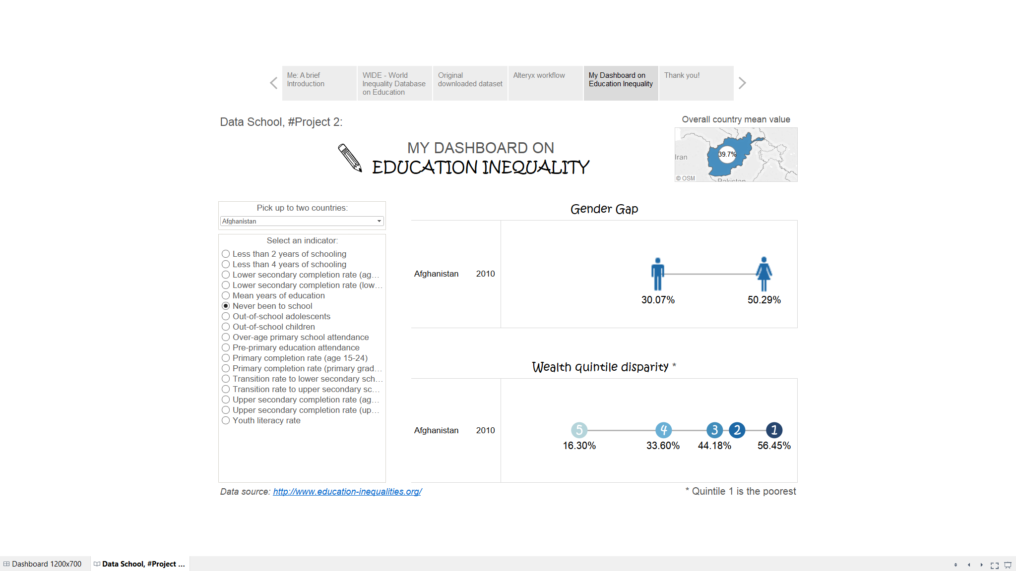
Click on the Image to go to the Dashboard!
Four things I learnt while building this dashboard:
- Alteryx power!
I decided to build a viz based on the WIDE database but, when I downloaded it, I found it kind of hard to start my analysis from those raw data. That dataset is a one-million-rows excel file, with a lot of ‘null’ records. Well, with a few drags and a few drops I was able to reduce the dimension of the dataset, clean it up, and convert it in a Tableau Data Extract format. Amazing!
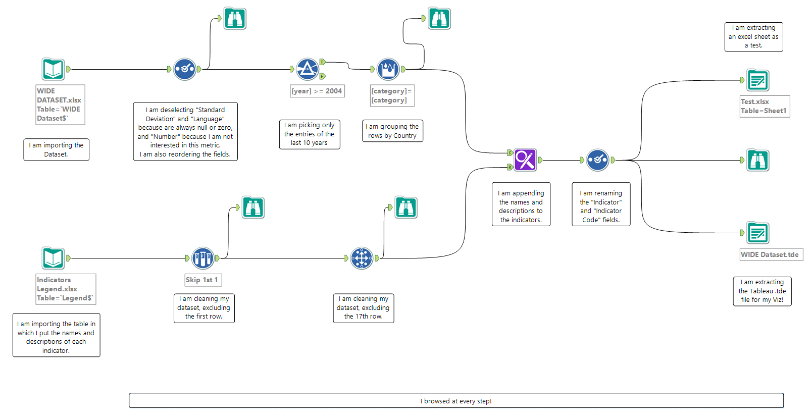
The Alteryx Workflow I used for cleaning up my data!
- LODs of Fun!
LODs are fun shortcuts. They keep you out of troubles when you need to drill up or drill down your level of detail, without changing the viz.
The WIDE database gathers together figures from different surveys operationalized in different years. For instance, the most recent figures for Afghanistan relates to 2010, but the most recent for Bangladesh are dated 2011.
Therefore, I created a LOD calculated field:
{FIXED [Country],[Indicator] : MAX([year])}
and filtered my viz for the years equal to that calculation, so that the result is always the most recent figure for each country.
- Values in numbers vs Values in percentage.
It happens that all the indicators in the WIDE dataset are in percentage… excluding one: “Mean Years of Education”. However, I wanted my viz to show percentages for percentages and numbers for numbers.
There are two ways to achieve this result: One is well described on a blog post by coach Andy, and involves pretending your percentages to be negative, and then changing the custom format. Smart, but it didn’t work for my viz, as it inverted my axe when showing the fake negatives.
So I decided to write an IF statement transforming in percentages all values different from “Mean Years of Education”, and use it as my label. To do so, I had to multiply the values per 100, transform them in strings, and then add ‘%’ at the end. Unfortunately, when I tried to transform in string the rounded value, Tableau behaved weirdly.
A rapid google and… I was facing the first Tableau Bug of my life! How exciting! I read the posts on the forum, and I found the workaround suggested by Tableau, which I had to customize to make it work for my case.
This is the calculation I ended up with:
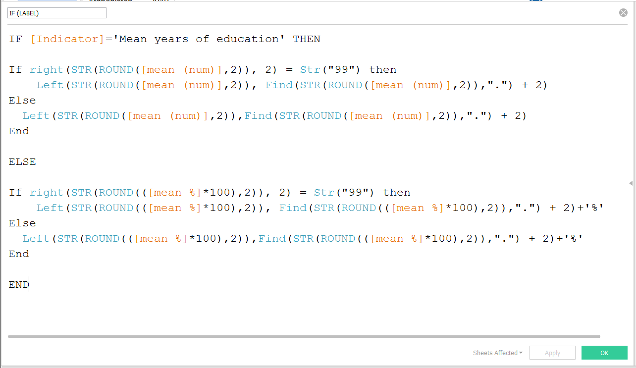
The calculation I used for rounding and showing the values
- Drive your reader, and (politely) interact with her/him!
All the design efforts I made to clean up my viz would have vanished if I had let my reader comparing in more than two countries.
Therefore, I chose to make my Dashboard interactive, filtering all the views for “Number of Countries” greater or equal to 2.
This makes the charts disappear if the user select more than two Countries, but it risks to disappoint the user. Therefore, I created another worksheet with just a title: “I am sorry, you can only select up to two Countries”, which pops up when the others disappear!
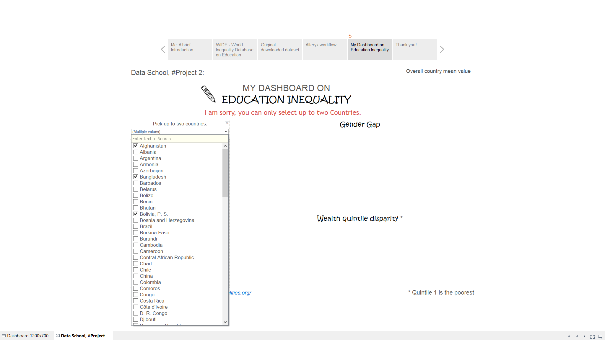
My ‘I am sorry’ sheet!
I genuinely believe that challenges are the engine for learning, and this viz was full of them. I could probably have achieved a similar result in some easier ways, but facing the bug and reverse-engineering the workaround to make it fit my viz was an exciting adventure, and presenting my work on Tuesday was just the cherry on the top!