


We survived the first week of Data School!
This first week of Data School has been a good mix of fun and challenging. Andy definitely gave us a taste of what is to come with some of the challenges he threw at us this week, from having to build multiple charts using a very limited dataset consisting of just 2 numbers, to getting us to create a makeover of a very confusing William Tate dataset.
We’ve learnt so much this week and already it has been put to good use by the group.
Here’s a quick rundown of the week and my top 2-3 favourite topics from each day (Missed day 1 as it is in my previous blog):
Day 2 – Andy’s first challenge and Carl Allchin gives us an intro to Tableau.
- Hand drawing as many chart types as possible using only 2 numbers.
- Trying to recreate the hand drawn charts in Tableau.
- Learning the quickest ways to filter using the data source window
Day 3 – Caroline Beavon gave us a masterclass on Infographic Design and best practices.
- Learning the correct way to get started when building an infographic.
- Using the ‘post-it note and paper’ method to start planning what will go into your infographic and where it will be best placed.
- A scenario of building an infographic for a client.
Day 4 – Andy gives us the trickiest challenge so far whilst teaching us more on the basics of Tableau.
- Andy challenges us to build a dual axis/combined axis lollipop chart – It was tough.
- Preparing to makeover one of our first visualisations (more info below).
Day 5 – SCRUM and our first big presentation
- Understanding the SCRUM project management methodologies and how it works.
- Making over our Data School application visualisations.
- Presenting to the group with a few additional eyes in the room and tuned in online via GoToMeeting.
Since the week ended with us doing our makeover presentations I think this would be a good time to show you how I have put what I have learnt this week to use in creating better visualisations.
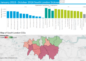
My first submission to the Data School
*Drumroll* – The makeover
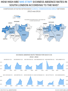
I thoroughly enjoyed the makeover process and also learning how to go with a minimalist design which took a lot of restraint as there was so much more that I wanted to add in the form of colours, more charts and additional bits and bobs that probably would have ended up looking a bit too cluttered.
The interactive versions of these two visualisations can be found on my Tableau Public profile.
Please feel free to leave your feedback on my visualisation and advice on what could be done better.
Marcus