


The project of this week was really nice, I had the chance to learn more about Alteryx and its tools. I had to prepare one hour training module in Alteryx about “CREATING DISTRIBUTIONS”.
So… I started investigating about this topic and I ended up structuring the training session into 3 parts:
- Data investigation tools – FIRST INVESTIGATION
- Predictive Grouping – CREATE CLUSTERS (Benedetta explained already in this blog post)
- Data investigation tools – INVESTIGATE YOUR RESULTS
But what are these data investigation tools? Actually, I never heared about them before this week and this is one of the reasons I really love Alteryx: every time I need to so something really specific I end up discovering new tools and features and it is amazing!
These tools are based on R and they are really useful for a first data investigation. Before a process or analysis takes place, users need to understand the details of their data.
Let’s look into some of these tools together:
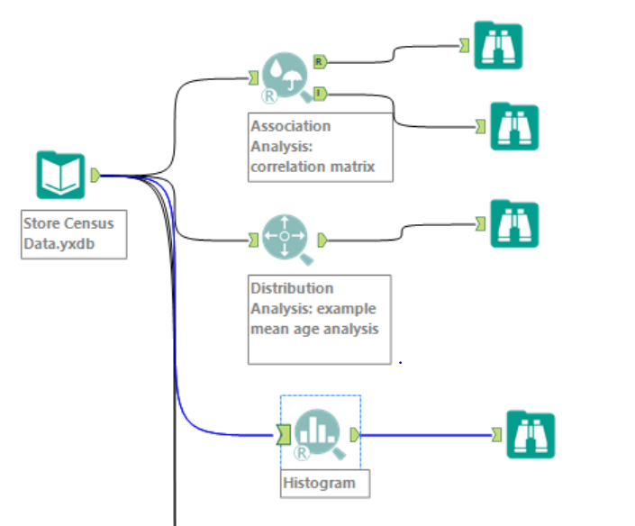
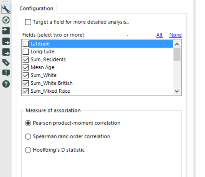
- Association Analysis: this tool generates a correlation matrix report (one static and one interactive), determining which fields in a database have a bivariate association with one another. It is possible to determine a target field (if there is a particular field of interest). I would suggest to investigate before a wider range of data in order to get a general overview of the correlation. In the example below, I just deselected Latitude and Longitude and use the Pearson product-moment correlation:
Here the interactive report:
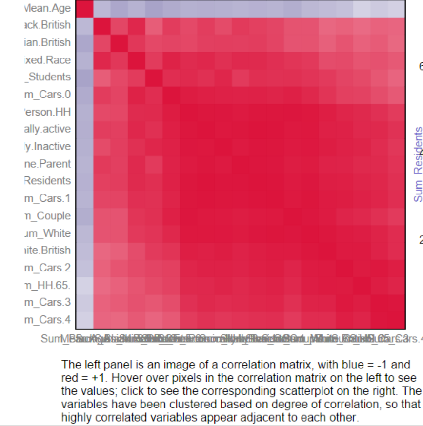
If you click on one of the small square, it will update a scatter plot on the right side of the report as below:
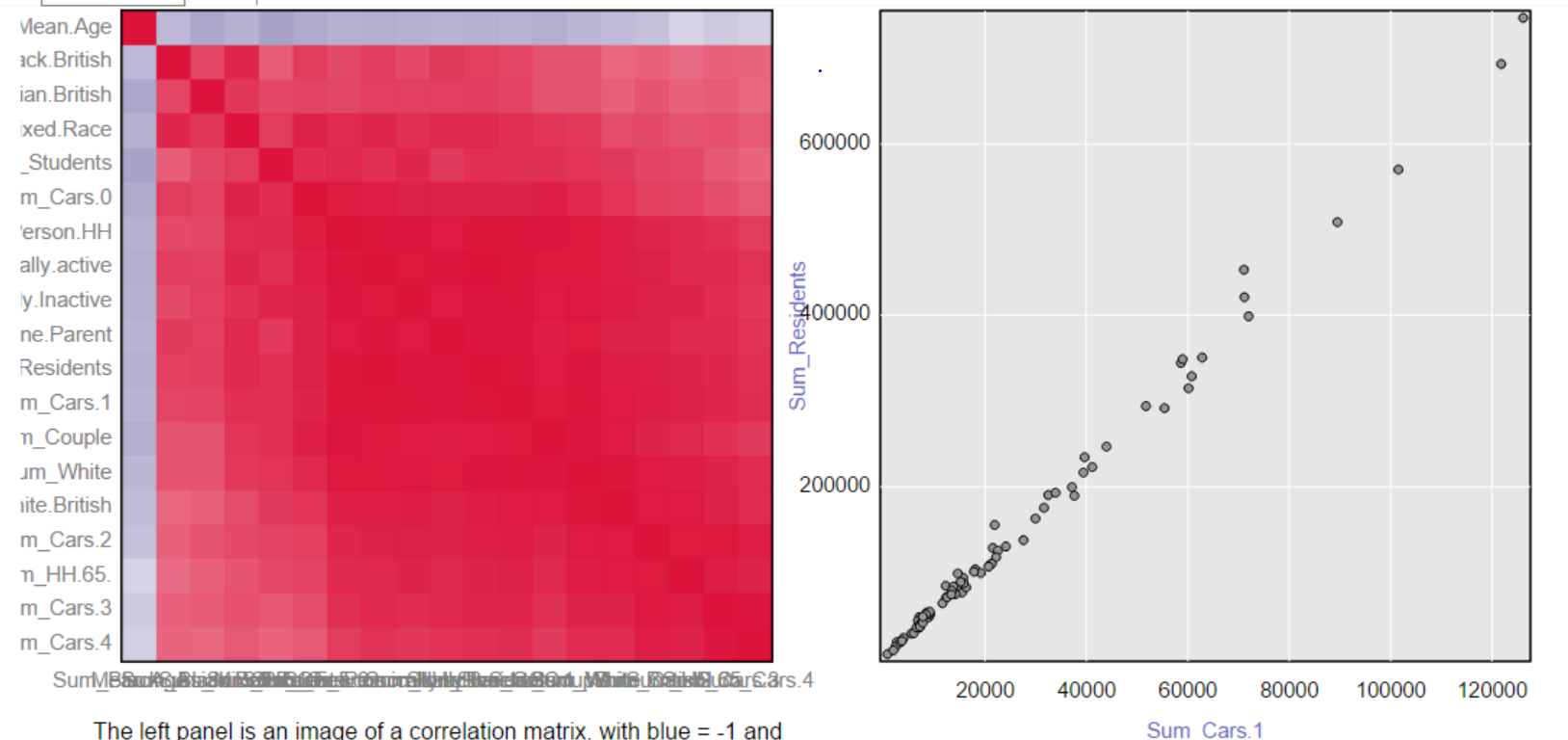
Red means strong positive linear correlation (~ y increases while x increases) while blue means strong negative linear correlation (~ y decreases while x increases).
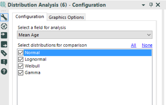
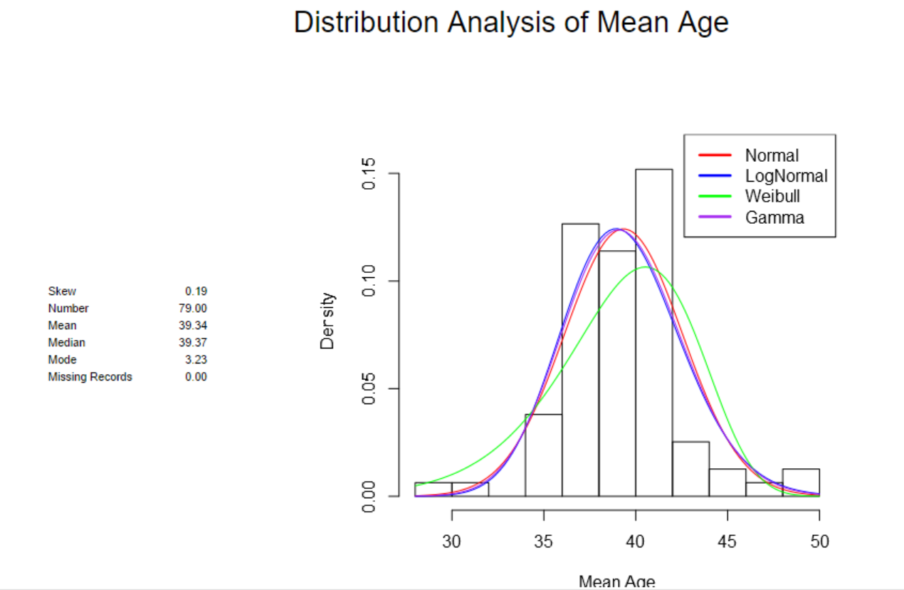
- Distribution Analysis: this tool allows to fit one or more distributions to the input data and compare them. It is based on the statistical significance (p-values). I selected the Mean Age field and all the distributions available, in order to see if at least one of them fits it or not:
Below the report:
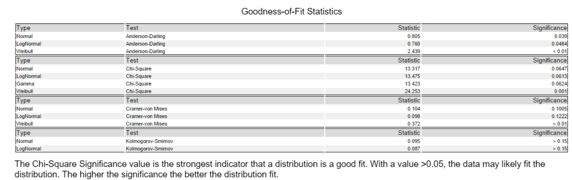
If we look at the Chi-Square test, it is possible to deduct that Normal, Lognormal and Gamma quite fit the distribution.
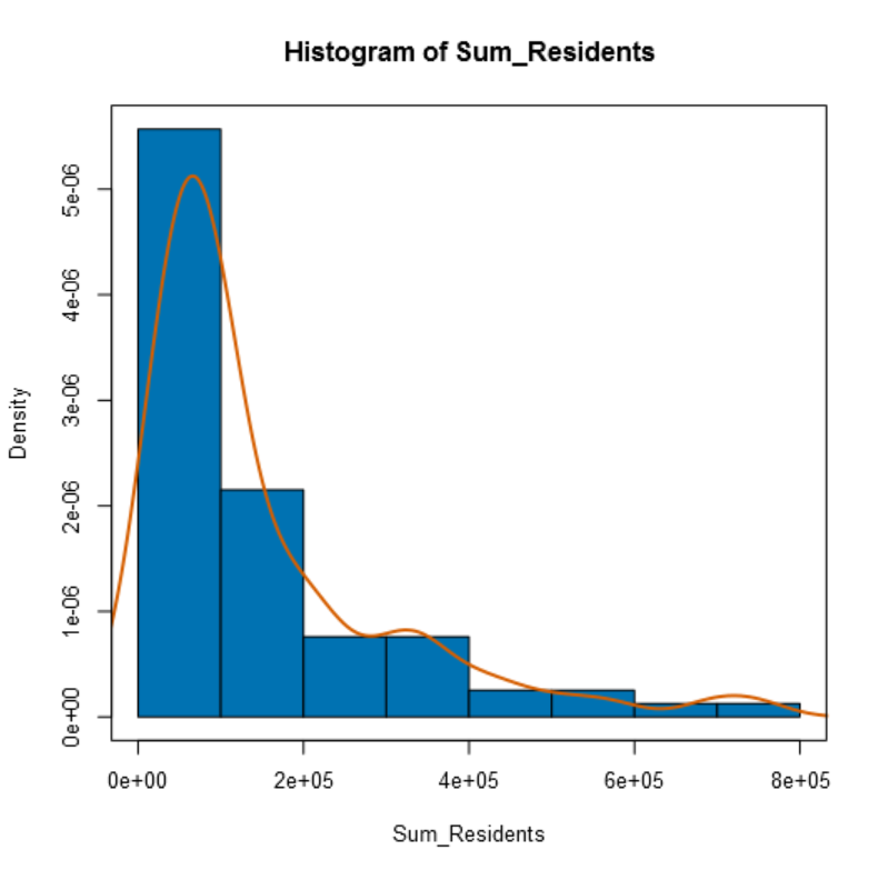
- Histogram: shows the empirical cumulative distribution of a single numeric field by showing the frequencies of records falling in a set of continuous value ranges. I selected the field Sum_Residents and break the histogram into 10 parts (it is possible to leave it also “auto”) and I plotted a smoothed density curve:
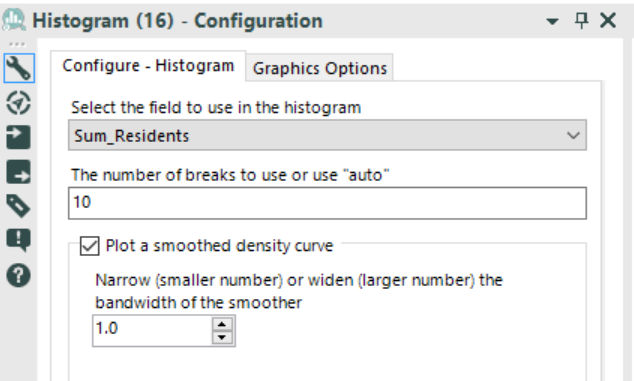
Below the view:
All these information can be processed in order to perform predictive analysis, such as predictive grouping (clustering). Below my workflow:
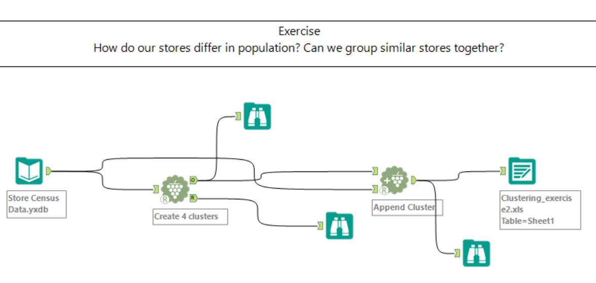
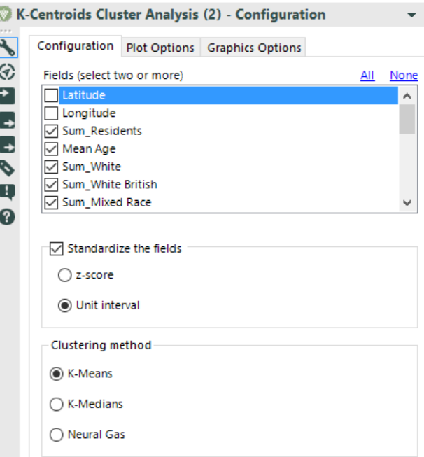
Below the settings of the K-Centroids Cluster Analysis (I selected all the fields apart from Latitude and Longitude, divide it into 4 clusters – do not forget to check the report and to use the Append Cluster tool):
After a process or analysis takes place, users need to investigate the results. I found some of the data investigation tools very useful.
I put as input data the output of the previous predictive grouping workflow. I used a select tool in order to transform the field Cluster into a string (it was a double before). Why? To use the data investigation tools on it!
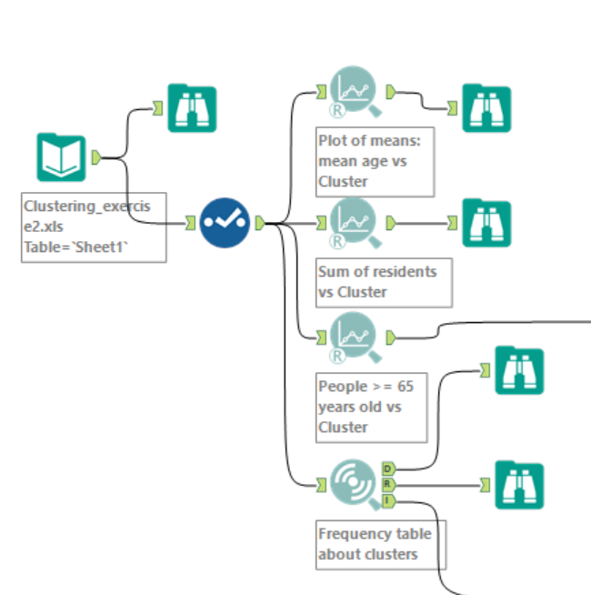
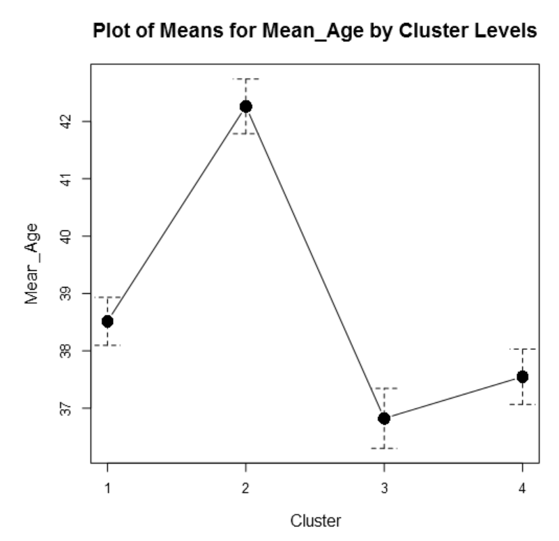
- Plot of means: the tool takes a numeric or binary categorical field as a response field along with a categorical field and plots the mean of the response field for each of the categories of the categorical field. I selected Mean_Age as response field and Cluster as categorical field to group by as below:
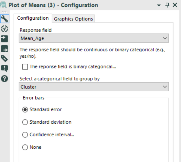
It is possible to observe how the age fall into the 4 different clusters:
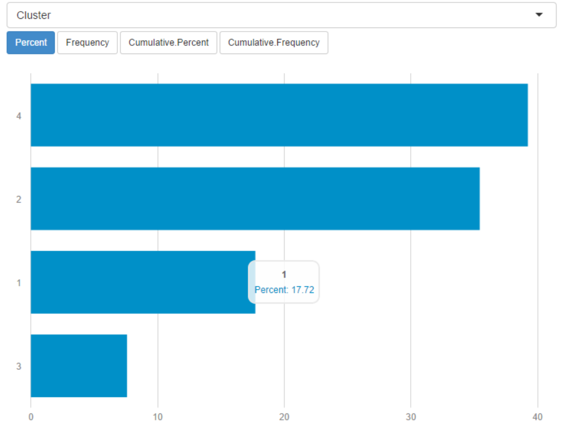
- Frequency table: the tool helps the user understand the contents of their data. For each field selected by the user, a frequency table is produced. The frequency table is a summary of their data with frequency counts and percentages for each value in a field. In my case, I want to look at Clusters:
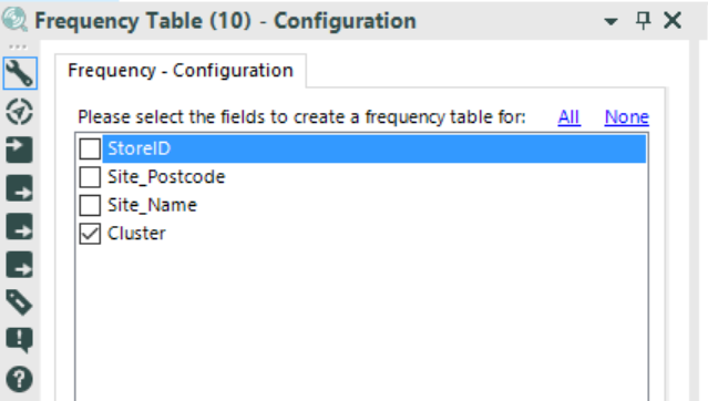
Below the interactive report:
I hope you enjoyed it.
A presto!