We continue on with dashboard week and day 2 involved data that was about alcohol - wine, beer and spirits. The task was to use one of the two data sets given and the main focus of it was the analysis and not the design.
There was a lot to go through in terms of data as the data I have chosen had a lot of tables and the important thing was to go through and pick out things you wanted to visualise. After going through the data, I ended up focusing on beer in particular to make the dataset smaller.
Once this was done, then it came to prepping the data and picking out things you might need and picking tables that you might want to show. I ended up using Prep for that. This is how the workflow ended up looking:
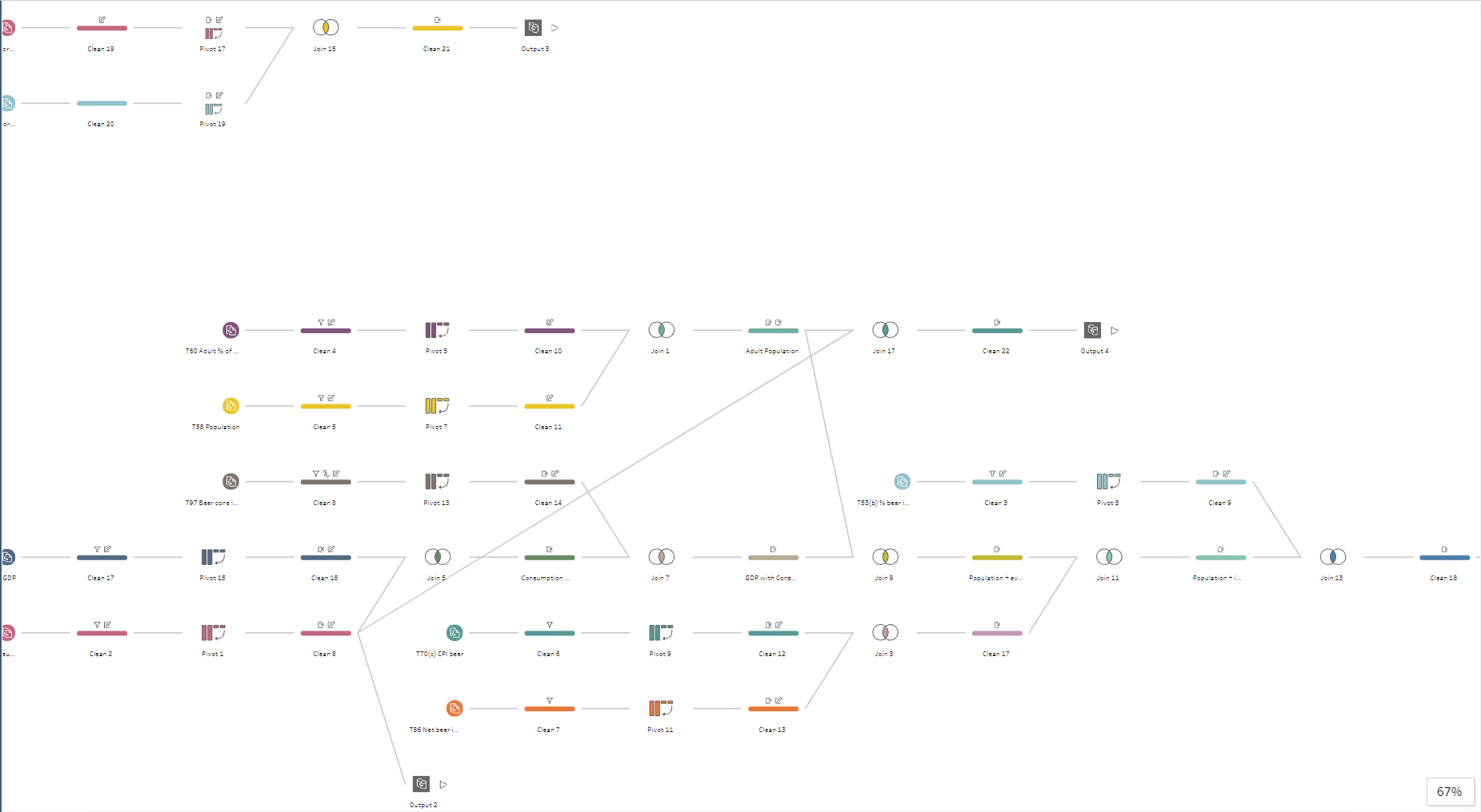
This looks like a lot is going on which was one of the pieces of feedback that I got but I will touch it again later.
After the data prep, I moved to Tableau to analyse and get some insights.
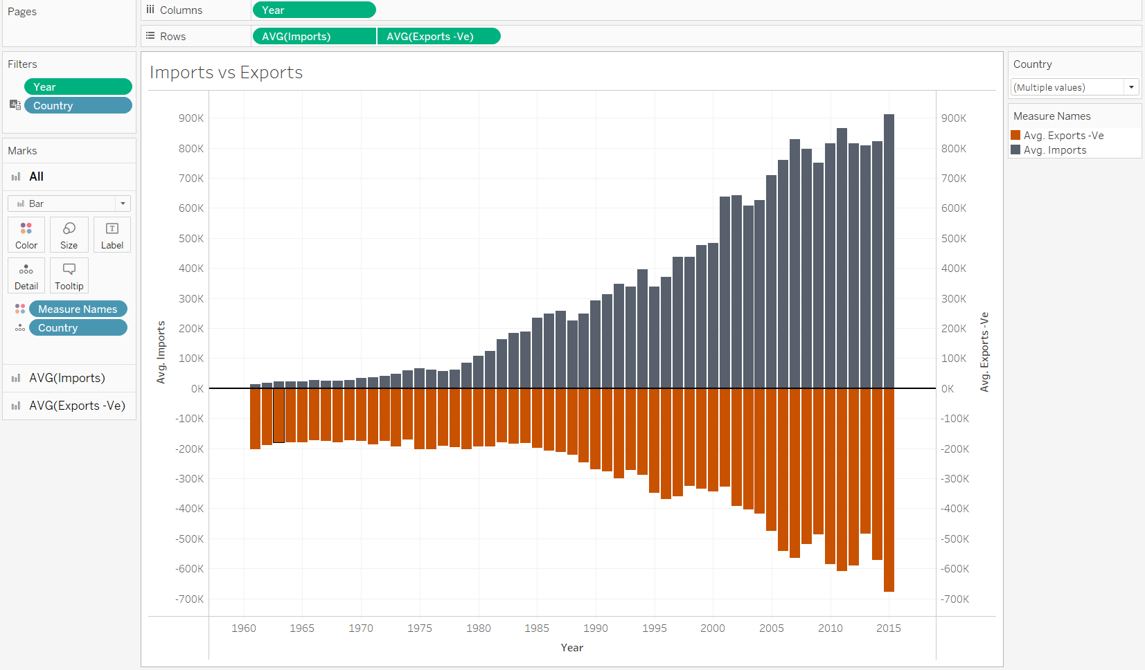
The result was not a dashboard but just a few charts because I ended up running out of time as I did not stick to my plan. For one of the ideas, I wanted to compare the exports and imports of beer, and this was what I came up with:
Some of the charts looked similar.
I think one of the issues I had was that I spent a lot of the time thinking about the data and what it was showing and joining too many tables together instead of focusing on smaller bits and breaking it down a lot more.
Key takeaways:
- Focus on the user story, what is it meant to be showing and what insights will people get.
- Focus on creating a less complex prep workflow when you've got a time constraint.
- Ask for help!