


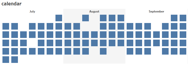
Continuing with the tutorial on how to build a calendar view (for Part 1 go here), let’s try to create a horizontal calendar (Andy used it in his #MakeoverMonday viz and it’s also a part of 2019 week 2 Workout Wednesday):
As in the previous part, I’ll be using Sample – Superstore data set that Tableau provides. Let’s dive in, shall we?
If you’re stuck, check out my public workbook with all the views described and don’t hesitate to contact me.
How to
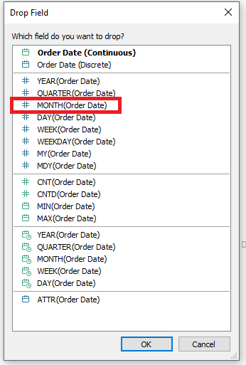
1.Right-click on Order Date and drag it onto columns shelf. From the pop-up window select discrete ‘MONTH’ (just like in Part 1):
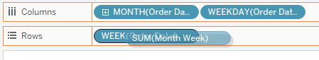
2. Right-click on Order Date and drag it onto columns shelf to the right of the month and select ‘WEEKDAY’ from the pop-up window.
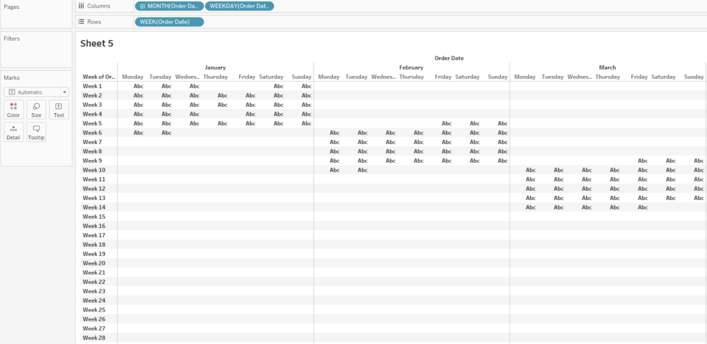
Now the party begins. In the previous part, when we were building a vertical calendar, we could just drag the week on the rows shelf and then we were left with some formatting to do. We can’t really do the same here as we will have all weeks on rows (see below) while we want to have 5-6 rows total.
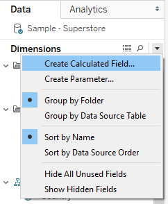
To solve this, we need to create two calculated fields. Click on the caret at the top of dimensions pane and select ‘Create Calculated Field…’:
3. Create a calculated field called ‘Month Start Week’. It’s an LOD (Level Of Detail) calculation which I won’t get into (that’s a material for another blog post itself):
{FIXED MONTH([Order Date]): MIN(DATEPART('week', [Order Date]))}What is happening here: the minimum week [number] is stored for every month. In other words, we know now what is the starting week of each month.
4. Let’s create another calculated field called ‘Month Week’:
DATEPART('week',[Order Date]) - [Month Start Week] + 1This gives us the week number at the month level. DATEPART function gives us the week number of the original date and subtracting the starting week results in a week number of the month. For longer months (29-31 days), we can get five or six different values depending on which day of the week the month in question had actually started. If 01 March was on a Monday, it will have five weeks; if it started on a Saturday, it will have six weeks. The ‘+1’ is optional, it means that the week numbers start at 1 rather than at 0.
5. Armed with calculated fields, let’s continue and replace the WEEK pill with Month Week by dragging Month Week on top of WEEK (make sure the border around week pill shows up):
Still doesn’t seem to work? Right-click on the Month Week and select ‘Dimension’:
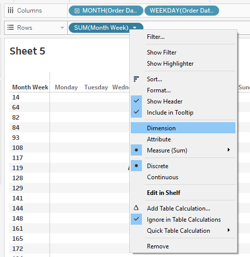
(Edit: You can also move both created fields from Measures to Dimensions.)
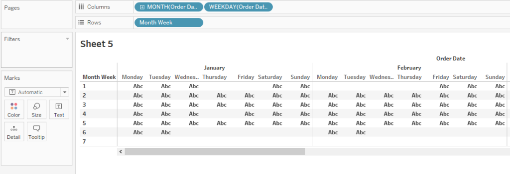
This is what you end up with:
Alright!
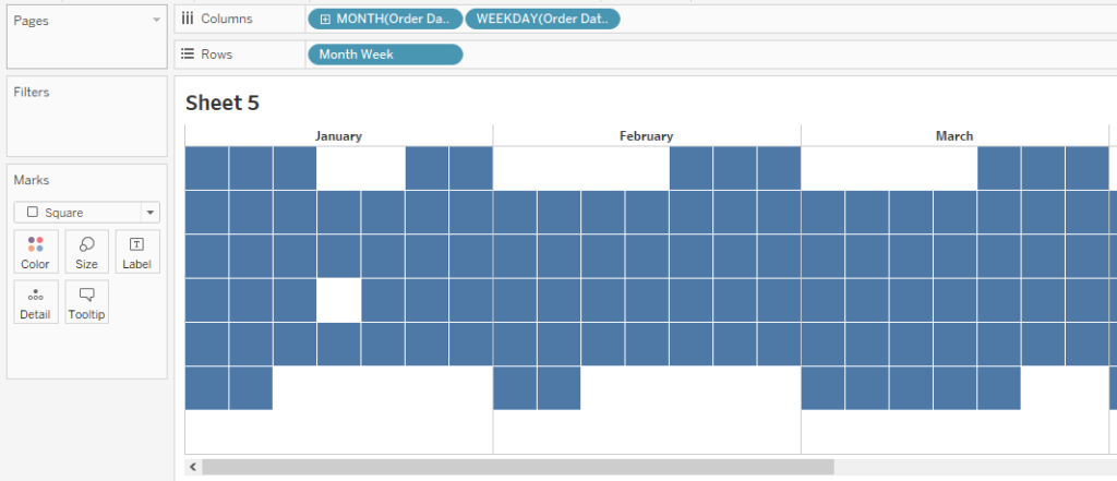
6. Let’s do some formatting:
– resize the rows and columns for more square-shaped cells
– change the mark type to square
– add white borders for a cleaner look
– change the size of the mark (Size on mark cards)
– hide the week numbers
– hide the ‘Order Date’
(- hide the weekday)
You should have a similar view to that one below:
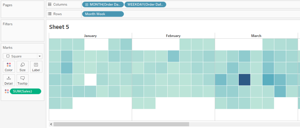
Nice, now that we have that, you might want to ask yourself what you’re trying to show (just like in Part 1).
If you want to show available data/ calendar – leave it for now, if you want to color-code some values – drag that measure (eg. Sales) on Color on marks card. Here’s what adding sales on color changes:
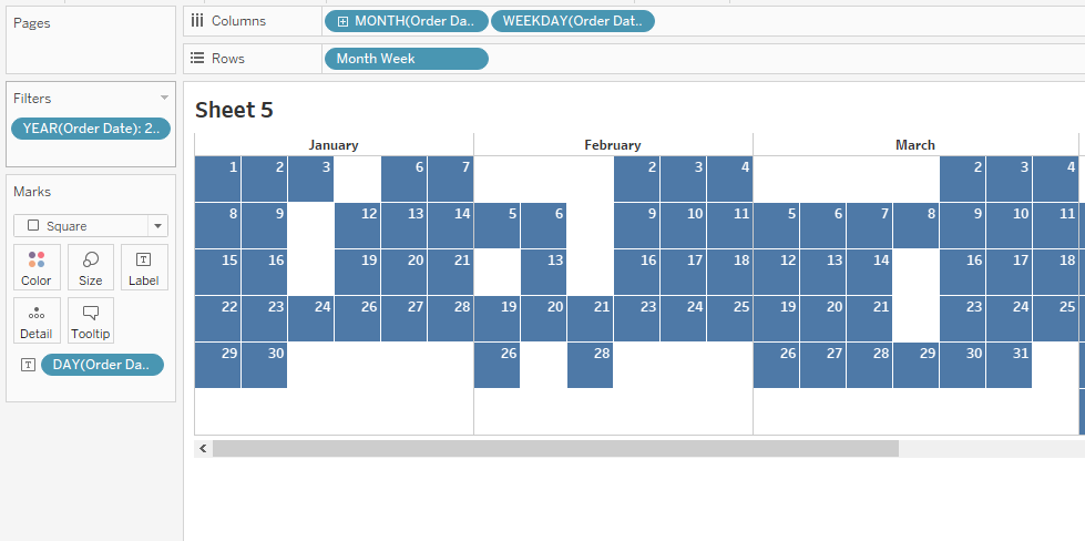
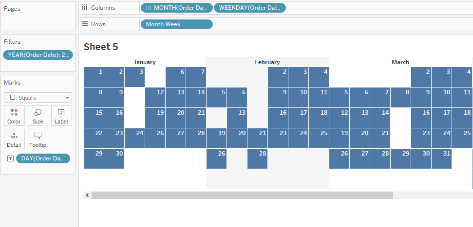
7. Add the labels: right-click on Order Date and drag it onto Label on marks card and select discrete ‘DAY’.
8. Oh no! Our view is messed up! Just like in Part 1, it’s due to multiple years. To fix that, just filter the date so that you only have one year in the view.
(ACHTUNG! We lost some of the weekdays for certain months. To fix that wait for Part 3. Until then, let’s carry on.)
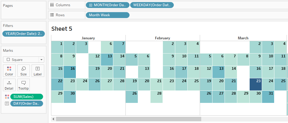
9. Change the alignment of label by clicking on ‘Label’ on marks card and adjust it to your wishes. Here are the results I got:
10. Let’s try to get rid of the borders and add some shading. Right-click anywhere on the white space in the chart area and select ‘Format’. In the format pane, click on the borders and change row and column dividers to None. Here’s what you should get:
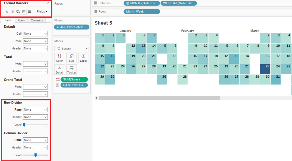
To add shading, click on the shading at the top of the format pane and change Column Banding for both Pane and Header. Drag the Level slider all the way to the left and this is what you should end up with:
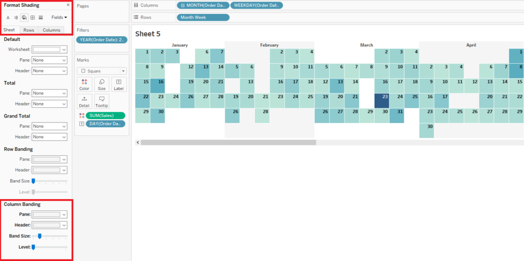
There you go!
If you try to wrap you head around showing all dates (including those you don’t have data for) wait for Part 3! I’ll also describe how to create a calendar that shows all 12 months in the same view. Byeeee!