Likert charts are useful for visualising survey data as they can give an indication of the general sentiment of the population towards a statement.
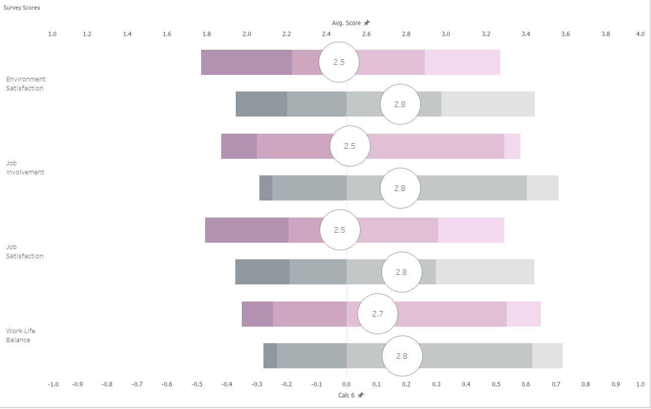
In this blog I will take you through the steps I took to create the Likert chart shown below:
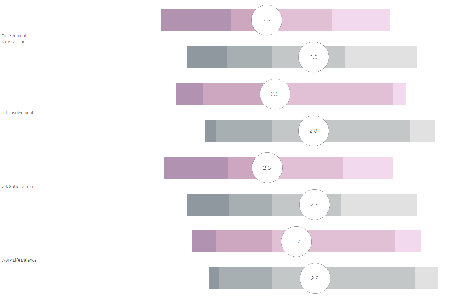
The above chart is analysing reasons for attrition in a company, with purple being used to show leavers. Using a Likert chart helps the viewer to easily identify poor job involvement and environment satisfaction as one of the main reasons for attrition.
To make this chart we will need to create 7 calculations.
Calculation 1:
if [Score]<2.5
then 1
elseif
[Score] = 2.5
then
0.5
else 0
END
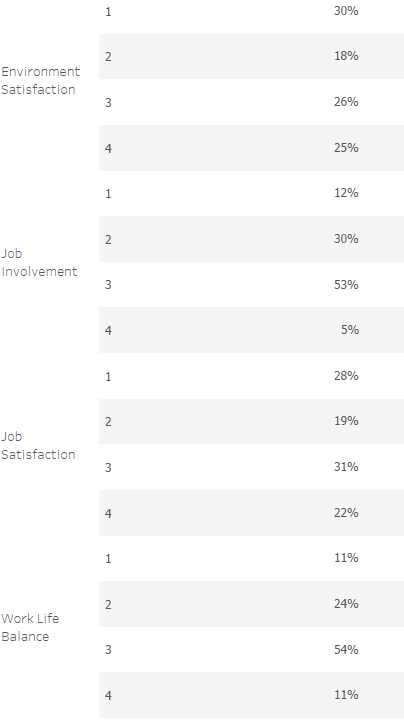
In this survey, employees had to rate each reason on a scale of 1 to 4. 1 being negative and 4 being positive. The median of this scale is 2.5. So in the calculation, and the chart, 2.5 is used as the middle value (essentially 0).
Calculation 2:
Total(Sum([Calculation 1]))
Calculation 3:
Total(Sum([Number of records]))
Calculations 2 and 3 will be used to help size our bars.
Calculation 4:
Sum([Number of Records])/[Calculation 3]
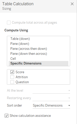
This calculation will size each segment of our bars. The way in which we will build this chart is using Gantt bars for each score and question. So this calculation will give us the size of each Gantt bar. This table calculation is computed along "Score".
Calculation 5:
-[Calculation 2]/[Calculation 3]
This calculation gives us the starting value for each of our bars in each question. Both nested table calculations (Calculation 2 and 3) should be computed along score.
Calculation 6:
PREVIOUS_VALUE([Calculation 5])+
ZN(LOOKUP([Calculation4],-1))
This calculation will give us the starting value for each of the segments in our bar. Since we will be building this chart using Gantt bars for each score and question, this calculation will give us the value for the Gantt bar.
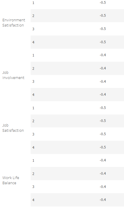
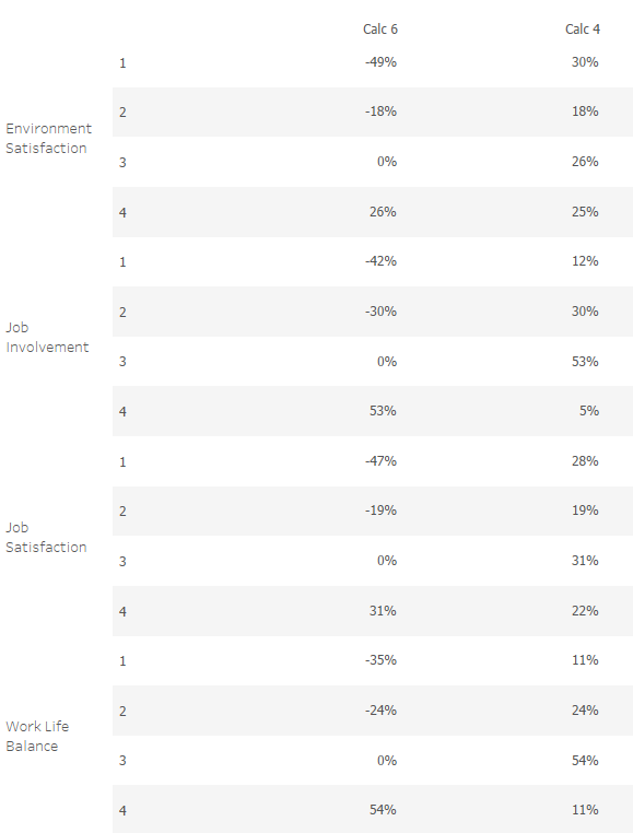
If we look at score "2" for "Environment Satisfaction" as an example.
This part of the calculation
PREVIOUS_VALUE([Calculation 5])
returns values from the previous row (when score is 1), which in this case would be -0.49 or -49% (exact value = -48.52%).
This part of the calculation
ZN(LOOKUP([Calculation4],-1))
returns 0.3 or 30% (exact value = 30.38) as that is the value from the previous row (when score is 1). The ZN() function just ensures any null values are returned as 0.
So for "Environment Satisfaction" when the score is "2", calculation 6 is doing
-49% + 30% ~ -18%
(-48.52% + 30.38% = 18.14%)
The logic behind this calculation is you add the size of the previous segment/score on to the Gantt bar for that segment/score to give you the Gantt bar for the next one.
Calculation 6 along with any nested table calculations should be computed against score.
Calculation 7:
AVG([Score])
This will just give the average score given by employees for each statement and will be the circle overlayed on each of the bars.
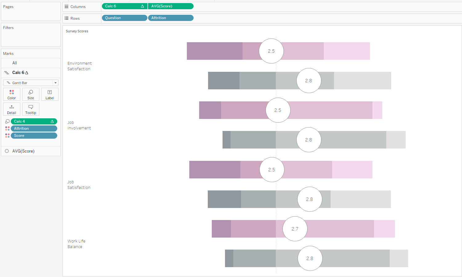
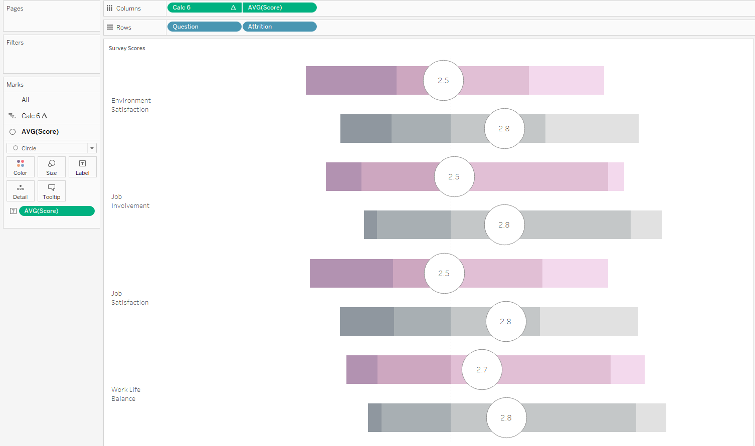
Below you can see how the chart is built:
The axes should NOT be synchronised and all table calculations should be computed against score. I have fixed the range of both axes. Calc 6 is fixed from -1 to 1 and the AVG([Score]) axis is fixed from 1 to 4 as those are the scoring options in the survey. You should see that 0 on the Calc 6 axis aligns with 2.5 on the AVG([Score]) axis, as 2.5 is the middle/median value out of the survey score options.
I hope this follow along made sense and was useful.