


Despite Tableau being a visualisation tool, it is quite common to be asked to create tables or replicate an excel report in Tableau. In this blog I will go through how to make tables in Tableau that are a bit more visual to help with changing the mindset of companies with more traditional infrastructure.
Instead of adding dimensions to rows and making a pretty standard table with many columns you can create dummy measures, which offer more flexibility, especially when it comes to formatting.
String Calculations
- Can create bulleted lists using the windows + . keys
- Can wrap text using regex:
regexp_replace( [text field], '(.{' + str([chars per row]) + '}\s)', '$1' + char(10)
Formatted Text
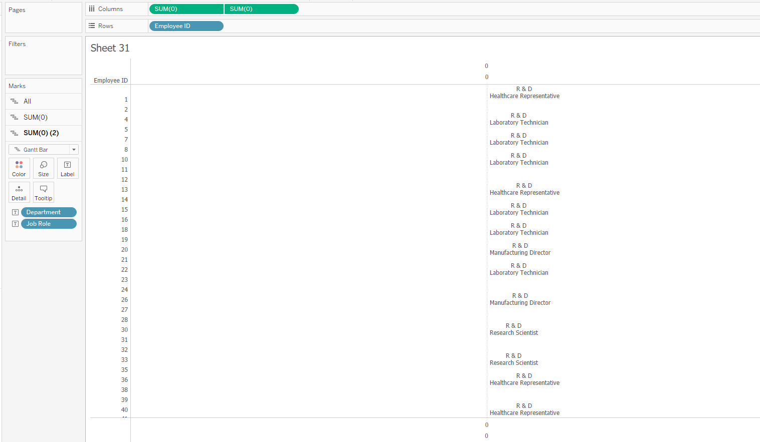
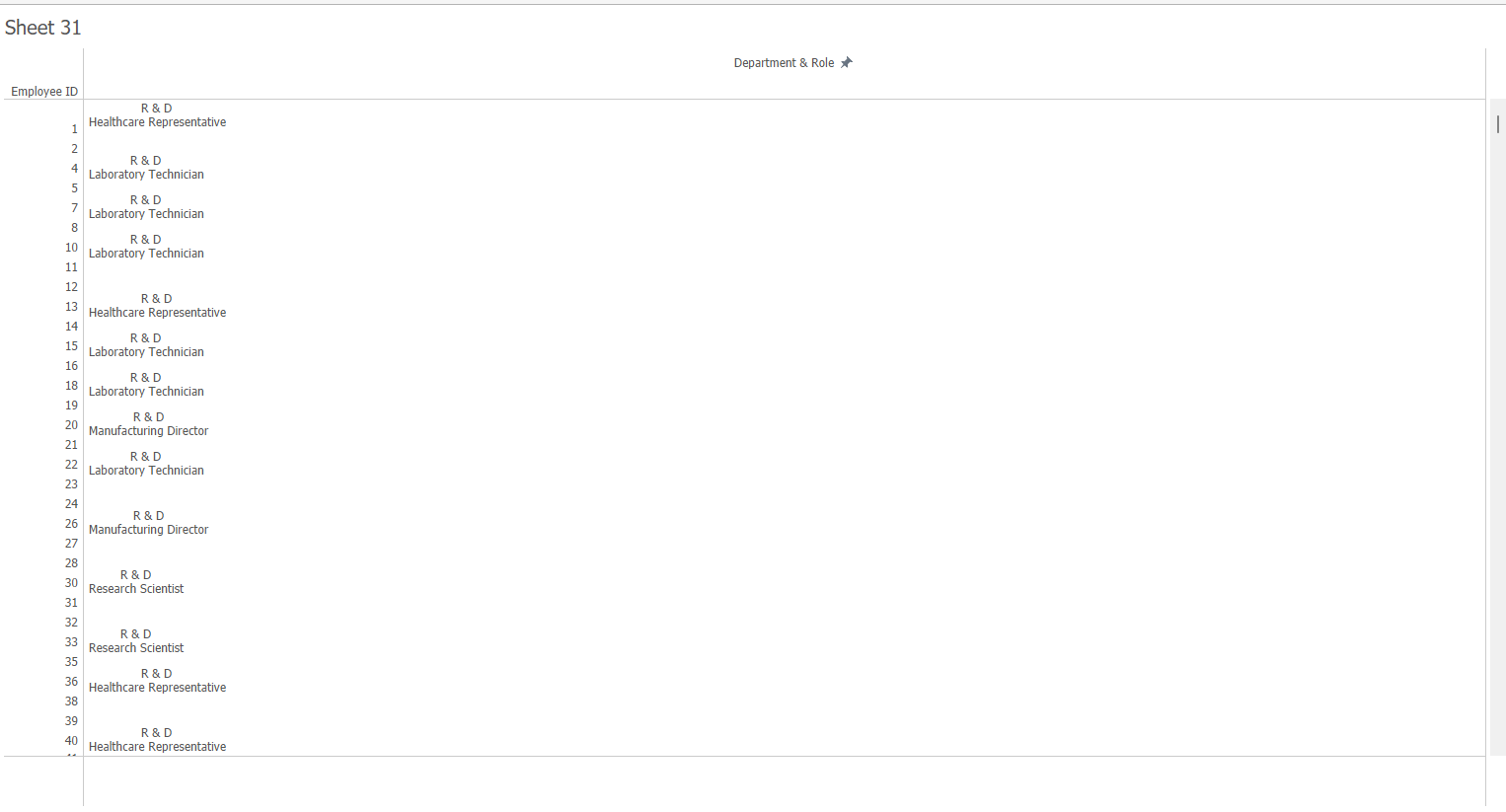
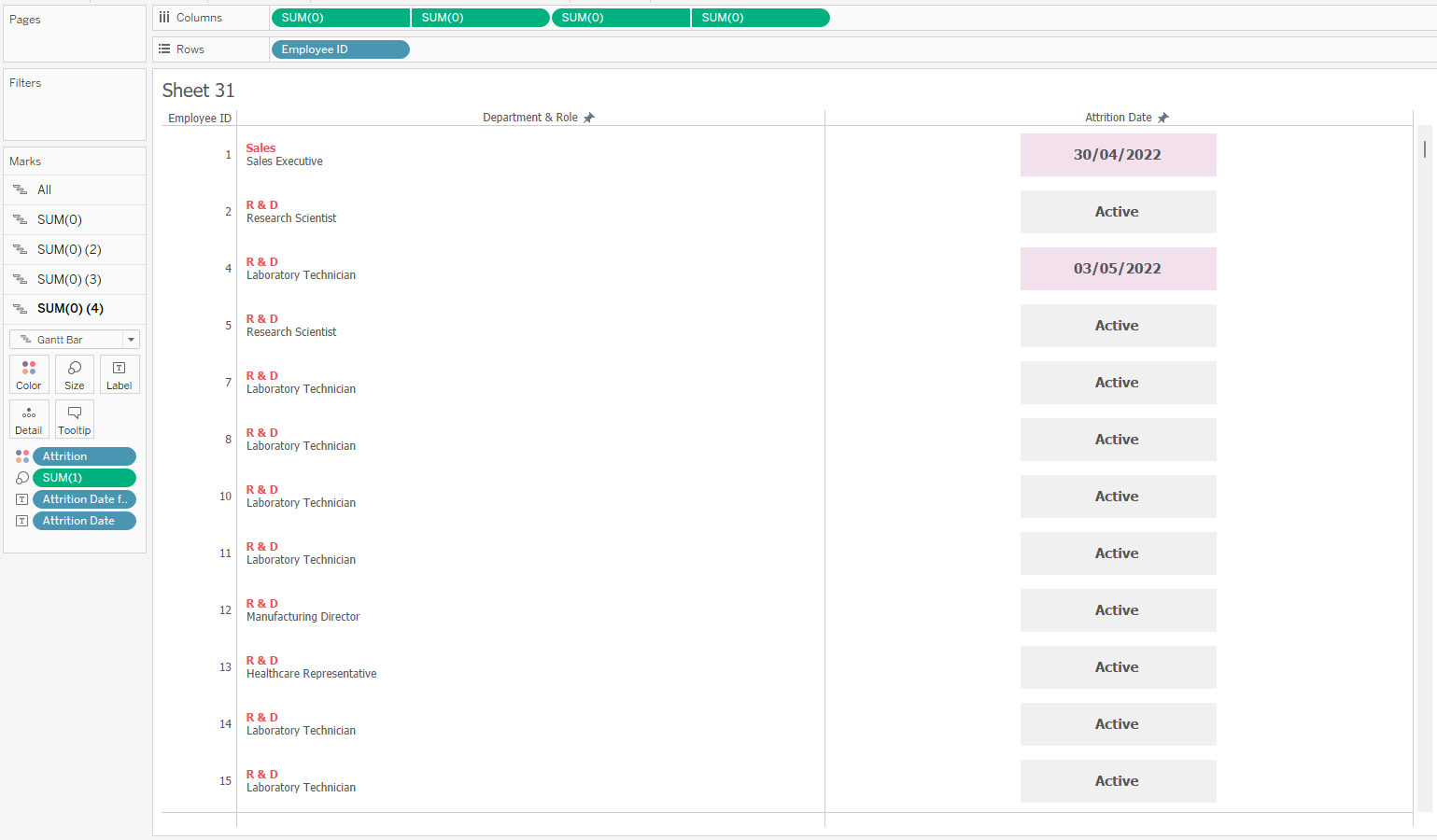
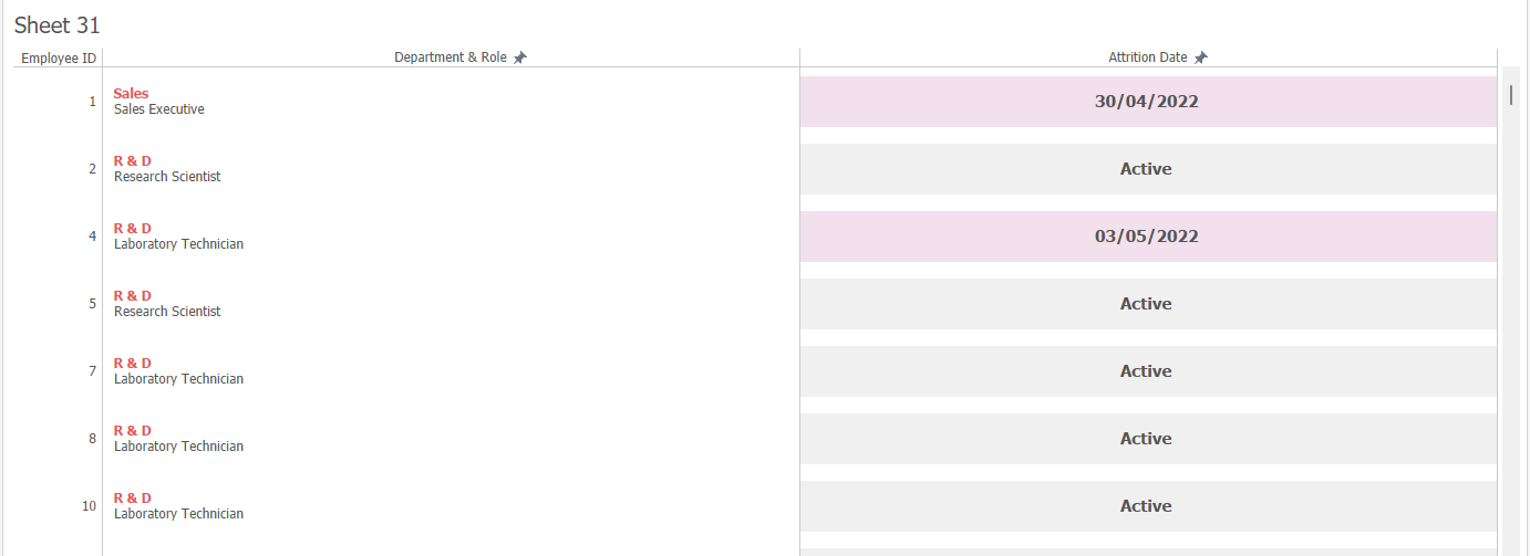
- Can create dummy measures and add fields as labels on the marks card. This offers more flexibility with formatting as you are able to format each field individually.
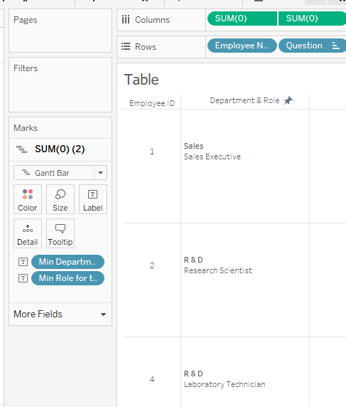
- Creating fields this way gives your more flexibility over the field order. If you add fields as dimensions, they will always appear first in the table before the measures. Using dummy measures gives you more choice over the field order.
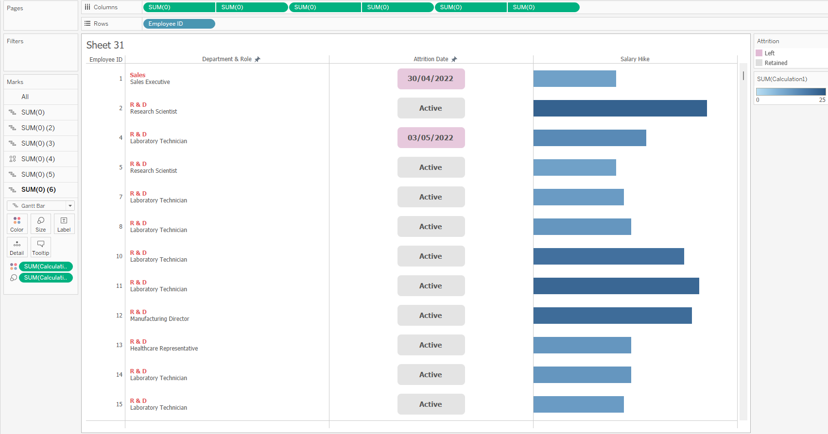
How to create these dummy measure fields
This can be created using a single measure field but in my example I am using 2 measure fields. This is so I can use one of the axes as a field header.
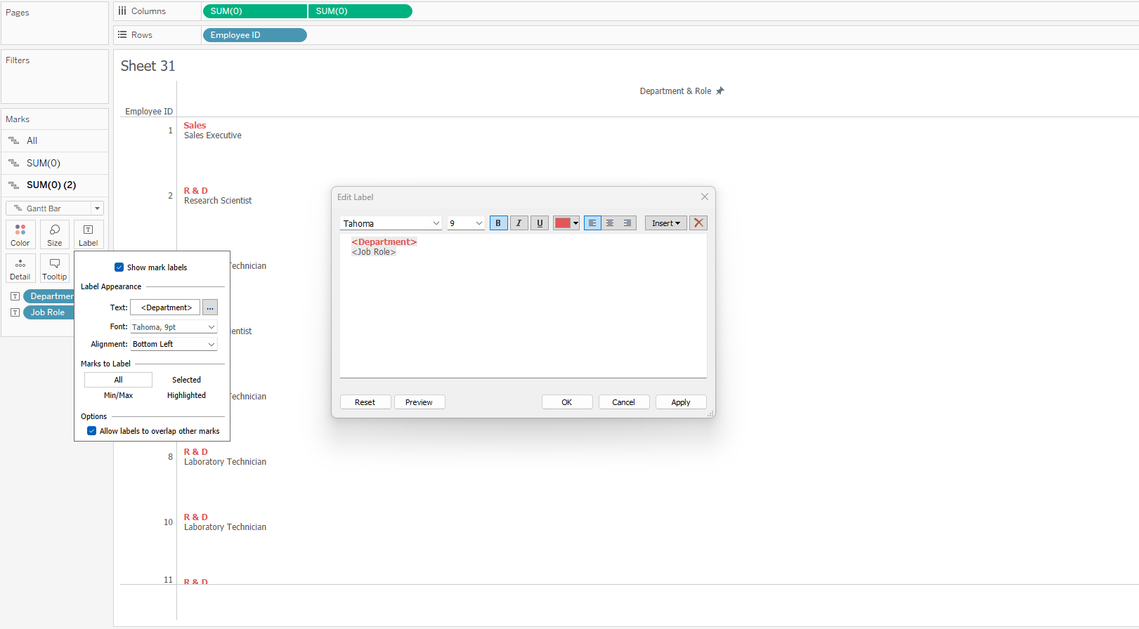
- Double click in the columns shelf and type '0'. After hitting enter, this should aggregate by default to a Sum(0) field. Do this twice.
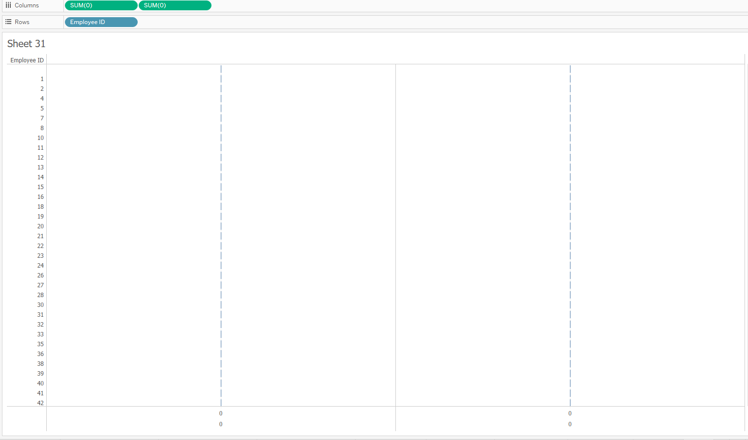
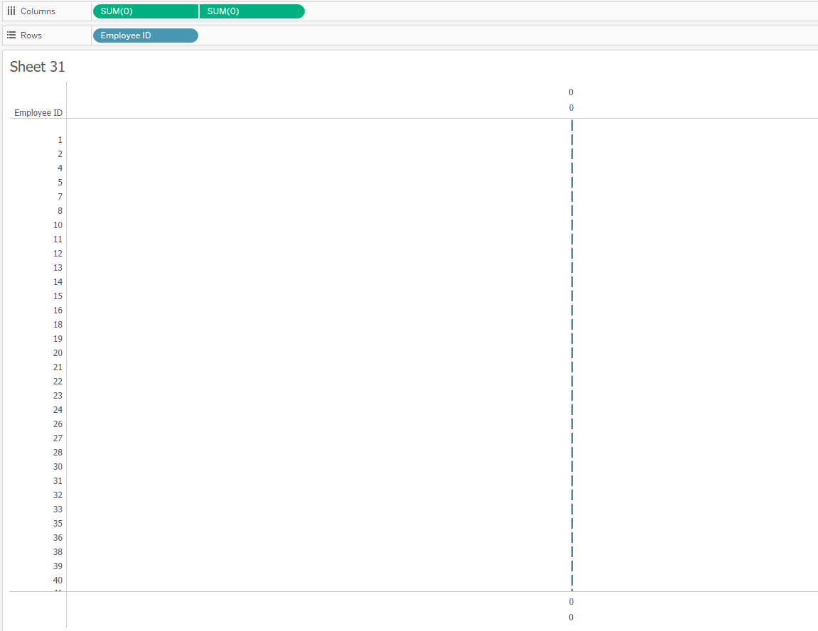
2. Right click on one of the Sum(0) fields in the columns shelf and select the 'dual axis' option in the menu
3. Right click on one of the axes and synchronise them
4. In the marks card for both fields, change the mark type to a Gantt bar (shapes, bars or Gantt bars usually work best)
5. Change the colour on both marks cards to make the Gantt bars fully transparent and change the size so they are very small
6. On the marks card for the second measure field, put your fields on to the text icon in the order you want them to appear in the table
7. Edit the axis range by right clicking on one of the axes. Set the range from 0 to 1
8. In tick marks, set the major and minor tick marks to none. You may need to do this separately for both axes.
9. Right click on the bottom axis and remove the axis title
10. Right click on the top axis and in the axis title type what you would like your field header to be
11. In the marks card corresponding to the second measure field (where you added the text fields earlier), check the box allowing labels to overlap and align the text however you wish. I've aligned mine to the left
12. Click on the labels icon in the marks card and format the text fields however you like. If you have aligned your text to the left as I have, you may want to add a few spaces before each field to give the text more space.
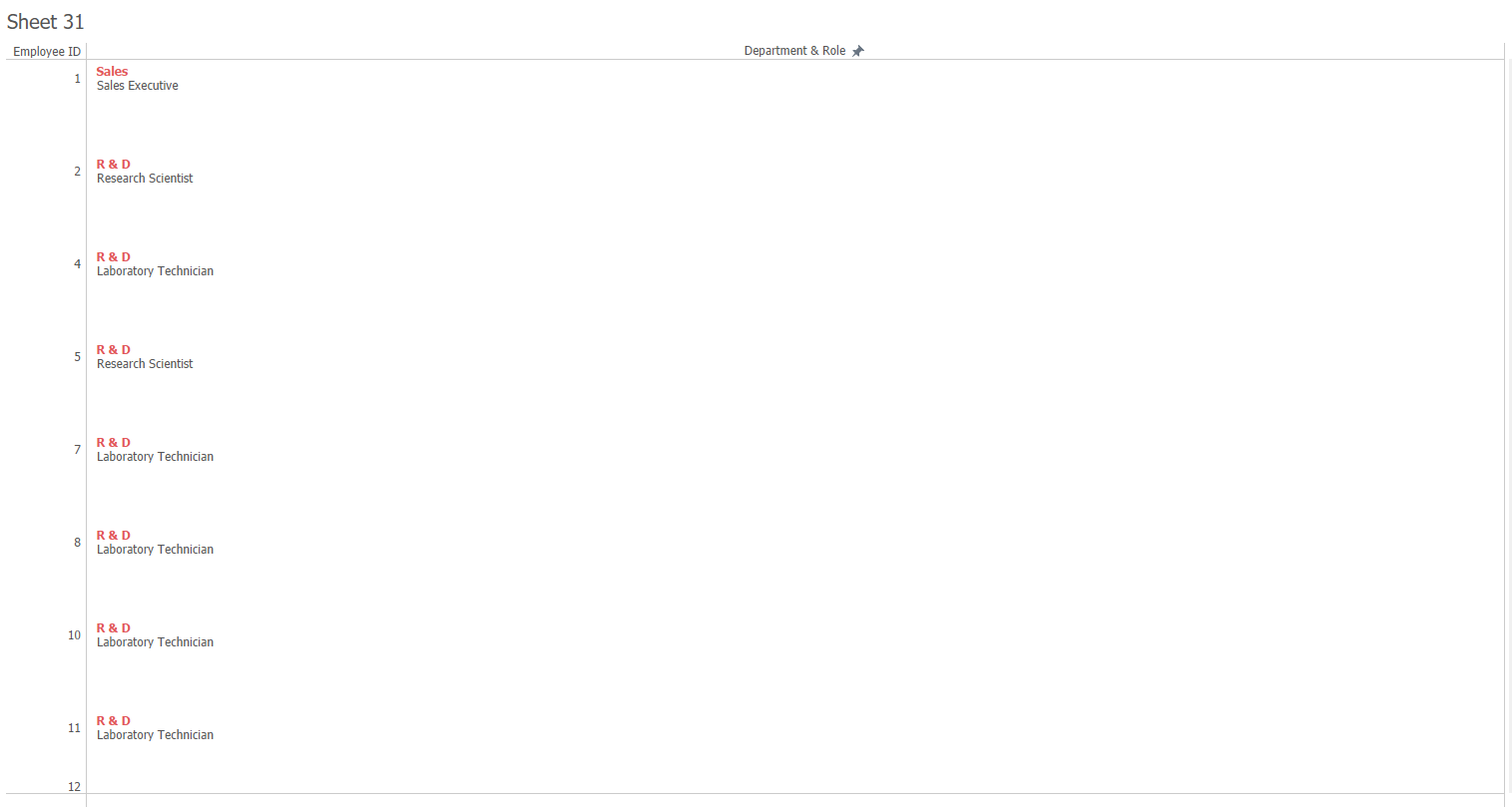
13. Lastly you can remove any grid lines or borders if you like and reduce the width of the axis at the top so the field headers line up. You can also change the width of the rows.
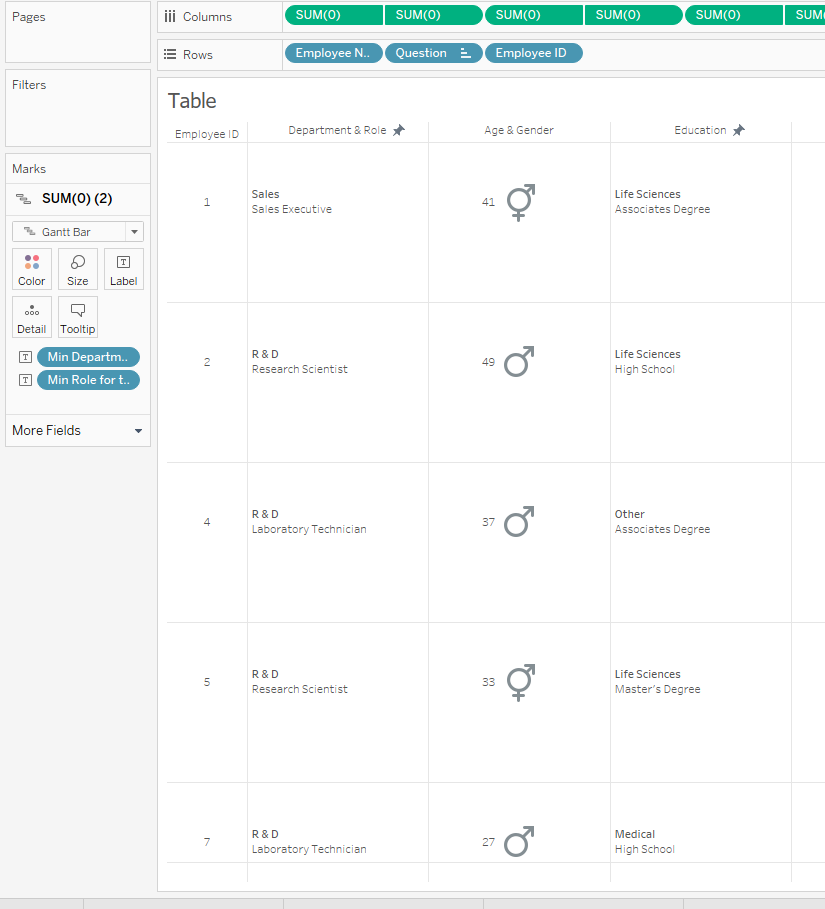
14. To add extra fields, just repeat the same steps
15. To re-order fields you need to rearrange/move both Sum(0) fields or pill that correspond to a column
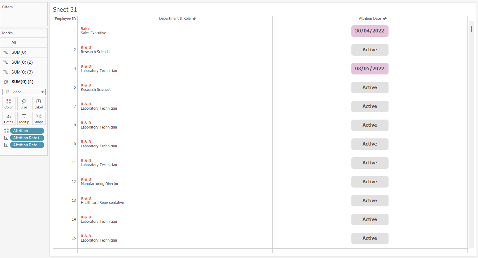
Adding Colour & Shapes
- Can repeat the same steps as above but format the cell/mark as well as the text
- To create this, set the range of your axes from -1 to 2, if you would like the Gantt bar to be centred in the field, and put Sum(1) on size in the marks card for the second measure field (second Sum(0) field)
If you would like the Gantt bar to stretch across the entire cell, then leave the axis range as 0 to 1 (see below)
- Increase the colour transparency and add a field to colour or change the colour using the colour icon in the marks card
- Remove any new grid lines that may appear
- Can also use circles or other shapes instead of a Gantt bar
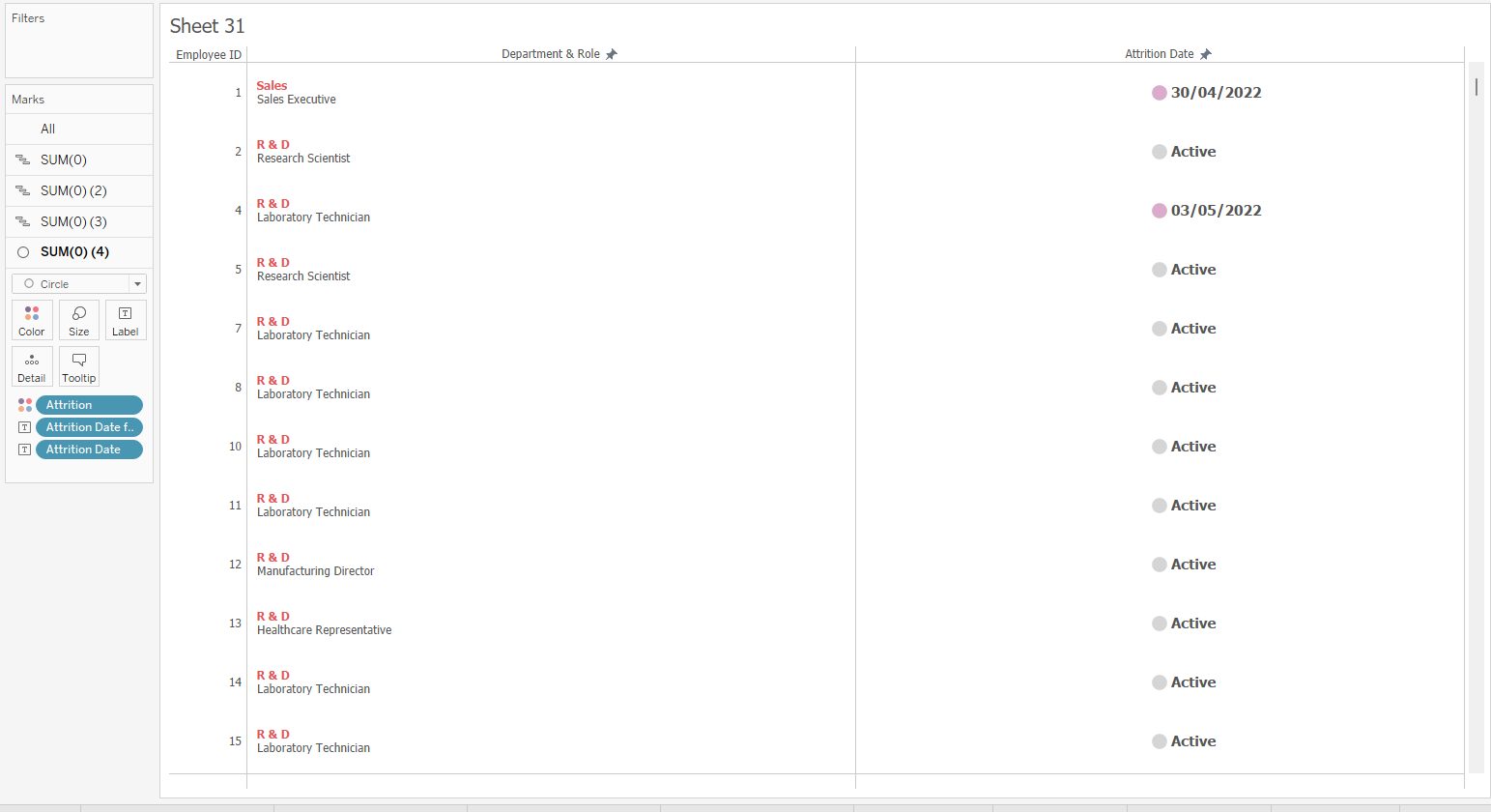
- To create the above, you can change the marks type for the second measure field (second Sum(0) field) to a circle or shape and then adjust the alignment of your text accordingly
- Edit the axis range from -1 to 1 so the shape is centred in the field
- You will not need anything on the size icon in the marks card. The size can just be adjusted manually
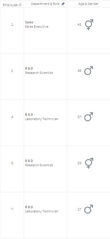
Colours and shapes can be a good alternative to text when trying to create a more visual table, especially if you have any categorical data. In this case I was able to use colour to distinguish between employees who have left and are retained in the company. For genders, shapes could be used (see below).
If there is any extra text that the end user would like to see on the table, then this can always be added to the tooltip of a mark to help declutter the table.
Including Charts
- Charts can also be included within tables e.g. bar and pie charts
- To create the bar chart above, leave the range for both axes as automatic
- Set the marks card to Gantt bar for the second Sum(0) field
- Put the measure field (whichever field will determine the size of your bars) on the size icon of the marks card
This can often be a nice way of introducing some visuals in to a table to help ease traditional clients/users in to a different way of viewing their data.
Advantages over Excel
- With excel reports, normally someone manually populates pre-made excel templates with the data, whereas in Tableau the data can be automatically updated and a refresh schedule can be set on server
- Alerts and email subscriptions can be set on the server
- Security, both row and column level, can be applied, allowing for the report to be distributed more widely
- Tables created in Tableau can still be downloaded and included in PowerPoints or reports just like excel reports. They can also be embedded in to PowerPoints so the interactivity can still be used: https://vizartpandey.com/how-to-embed-tableau-dashboard-in-a-powerpoint-presentation/
- Filtering and tooltips can help to elevate standard tables and allow users to explore their data more
Although this is quite a hacky way of creating a table in Tableau, it can still show off a lot of the capabilities and functionalities that Tableau has to offer, even if tables aren't really the main purpose of Tableau.
I hope this blog helps.