


Two weeks ago I set a task for the Data School team: write one blog post per day each for the whole week. Having been writing blog posts for years now, I knew this was not a simple task. It’s much easier to show tips than it is to write about them. We started a tally on the whiteboard, with champagne as the reward for all 40 posts getting written.

Every single one of the tips was terrific, but I thought I would recap my favorite from each of the consultants. In alphabetical order…
Emily Chen – Building KPI Dashboards with Shapes (Link)
In this post, Emily shows how to enhance your KPI dashboards with shapes. This helps the viewers interpret the dashboard much more quickly.
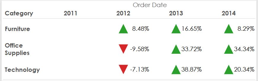
Nicco Cirone – Determining Whether a Number Is Even or Odd (Link)
You’d think this would be super simple, but it’s not. In this post, Nicco covers two uses cases.

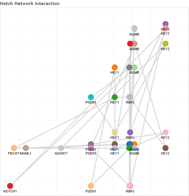
Alexandra Hanna – How to Create a Notch Gene Network (Link)
Tableau + Science…I love it! Alexandra teach us a bit about molecular biology and how to create molecular networks in Tableau.
Ravi Mistry – Serving up Some Rules to Optimise Your Tableau Server (Link)
What many people don’t realize about the Data School is that every week, not only are the consultants working on projects, but they’re also spending at least half of each day learning. During #TableauTipWeek, they were learning all about Tableau Server. In this post, Ravi gives some general tips for optimising Tableau Server.
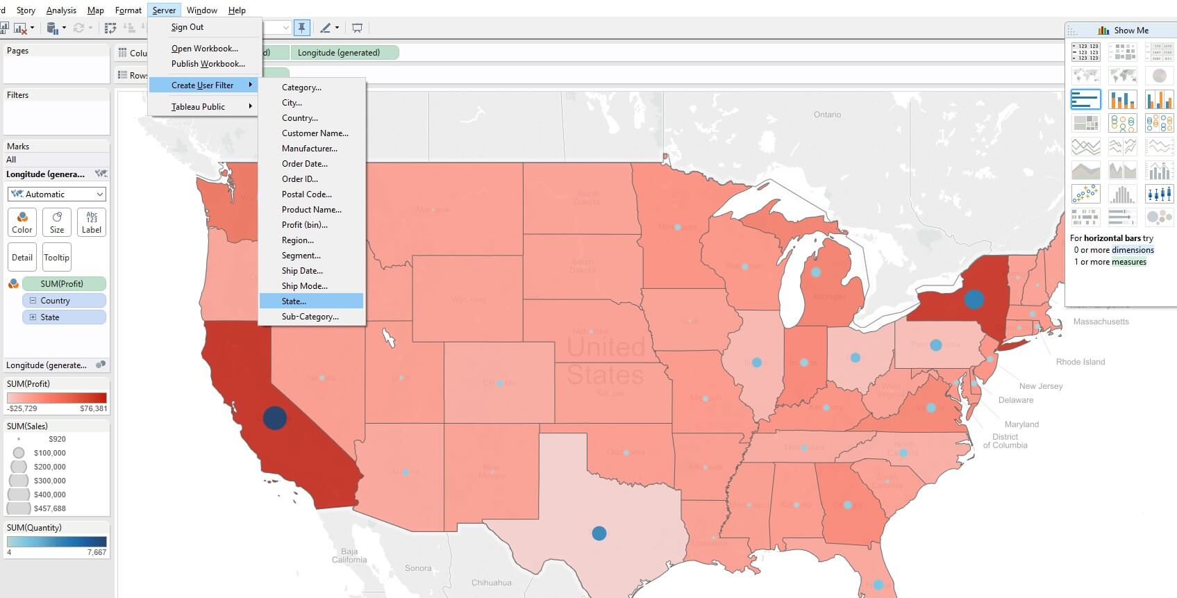
Alex Muntus – How to Create and Apply User Filters (Link)
This is one of the most powerful, yet most underutilized features of Tableau Server…user filters. Alex outlines when to use them and what they do.
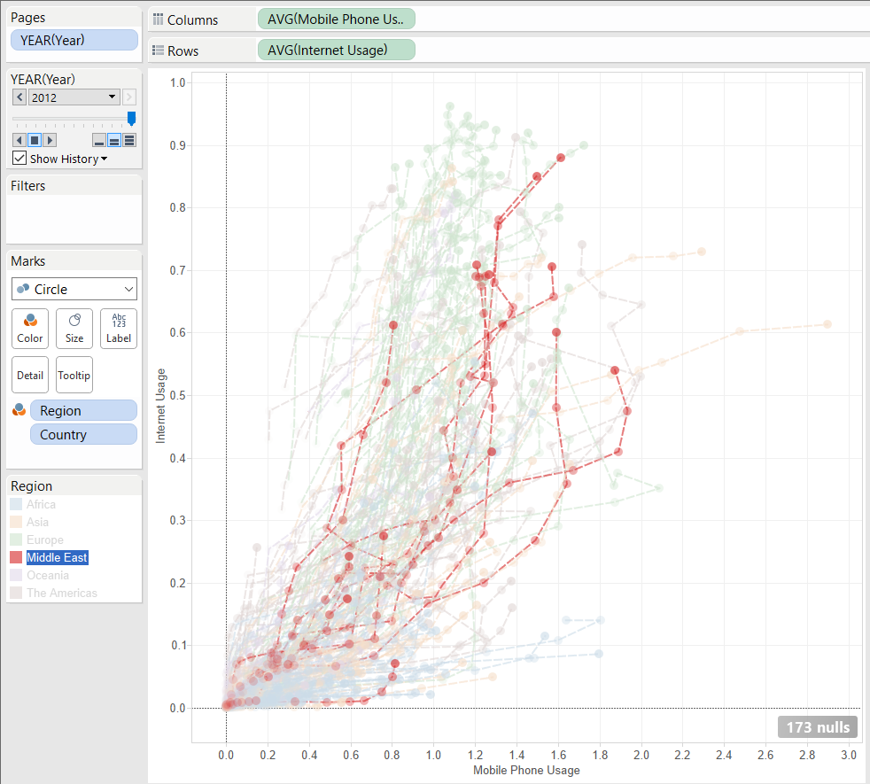
Pablo Sáenz de Tejada – How to Create Connected and Animated Scatter Plots (Link)
Connected scatter plots are an extremely good way to tell a story. Pablo shows you how to create them and how to use them in storytelling.
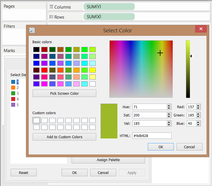
Hashu Shenkar – How to Use the Color Picker to Personalise/Brand Your Visualisations (Link)
There’s a great story about this post. I was working on a post of my own, and stumbled across something I thought was cool that I had no idea you could do in Tableau. So I gathered the team to show them. Then they all said “Yeah, Hash just wrote about that.” And there I was left deflated, yet so proud of the team for finding things that are hidden right in front of us all.
In this post, Hashu demonstrated the custom color picker. It’s pretty nifty indeed!
Damiana Spadafora – Using Story Points? Then Do It Well. (Link)
This is an excellent post for anyone that wants to know when you should (and should not) use story points. Damiana walks you through four story types and how story points works for each of them.
 What an incredible week! This team amazes me every day. If you’d like to be a part of the next team going through the Data School (beginning December 1), then sign up for more information or email me. We’re taking applications now, so get started on your Tableau vizzes.