


This week is the final week for the DS8 and the final project consisted on providing 5 Tableau tips for each member of the cohort. Even though a member was missing for the presentation, we collected 35 Tableau tips during the day, which are available to watch on YouTube., my patrt is from minute 19 until minute 29. You can find the workbook on my five Tableau tips on Tableau Public
Coming the DS training to an end, I have also written a reflective blog, which summarised my thoughts around this great learning experience at The Information Lab in London. You can also find all the Blog posts, which I wrote during the training at the bottom of this post. I have highlighted those used to provide my five tableau tips in here.
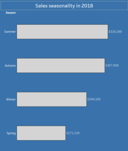
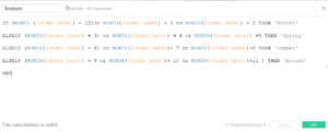
First Tableau Tip: Create season Date field
It is possible to Create seasons as dates in Tableau with a simple calculated field which establishes the month number and attaches it to the appropriate season. Different countries might have different seasons as well, so if you are reading from the southern hemisphere, bear in mind to change this calculation. Add a filter in year for instance to change your view.
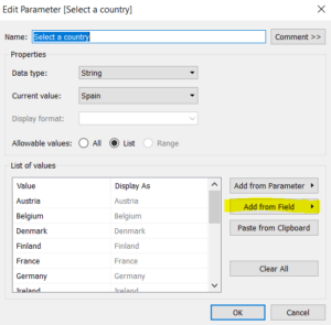
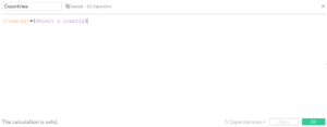
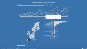
Second Tableau Tip: Highlight selected value
It is very easy to Highlight a selected value using parameters in Tableau and it can be used in different charts types as well. The first step is to create a parameter using the chosen field, I used country names for this example, click on the field and select ‘Show parameter control’. Then you can build a very simple calculation to use the parameter in the view. It is a boolean statement which sees the parameter created and the existent field used. Simply drag this calculated field into colour so when you select a value from the parameter, the calculation will be true and everything else will be coloured in a different way. I used this calculation here in a spark-line with countries, on a map but also in a bar chart with a lower level of details so more granular, looking at States/Regions.
Third Tableau Tip: Dynamically rename axis
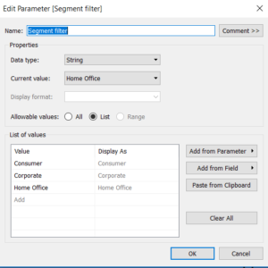
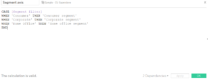
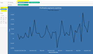
Following my blog on Workout Wednesday tips for Tableau I show how to dynamically rename axis names. Just create a parameter with the desired fields to filter. In this case I have used the Segment field. Show the parameter and then simply link it through a calculated field. The calculated field will only serve to provide a name to the actual value, you can rename it as you prefer but do remember that the parameter is case sensitive so when writing something like ‘Home Office’ keep in mind that not using the capital letter in the calculated field, it will make the calculation not working. Simply use the calculation in the rows and add the dimension field into filter. There are different uses of this techniques and they can be very useful for smoothing weeks and thresholds.
Fourth Tableau Tip: How to hide sheets in a Dashboard
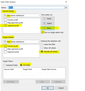
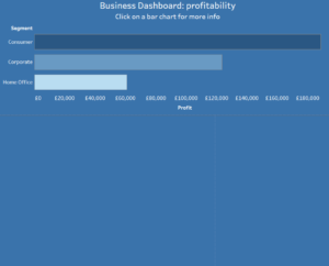
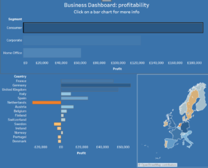
A very simple trick on how to avoid overcrowded dashboards at the first sight is using Dashboard actions in Tableau. In this case I have used dashboard actions to hide sheets which appears only with the selection of the sheet in the view, which functions as a filter. The first step is to create your sheets, it can be anything you want to create, you will need minimum 2 sheets, which have some fields in common. If for example you are using dashboard actions to provide more granularity in the view, always remember to put the higher level of detail in the view as well. The second step is to drag the sheets in a dashboard and link all of them together by pressing on the little funnel on the right corner saying ‘use as a filter’. After that you will need to go to the menu on the top saying Dashboard and click on Actions: add an action, filter. You will need to tick the box in Source sheet for the one that you want to keep in the view and in the target sheet click instead those that you want to hide when nothing has been selected on the view.
Fifth Tableau Tip: Transparent Shapes
With the Use of transparent shapes in Tableau
it is possible to create bar charts, which are actually visually effective as well. Start creating a bar chart and then simply add a transparent shape, which will need to be floating on top of your bar chart in the dashboard. Remember to select a transparent image and to use floating for it, in order to move it on top of the bar chart.
Blog posts I wrote during the training
- First day at the Data School
- Use Alteryx
- First project
- Tableau BI tool
- Create seasons as dates in Tableau
- Alteryx and predictive models application
- Use parameters in Tableau
- Conditional statement with an LOD in Tableau
- Meet and Greet: Apply to the Data School
- What is a decision tree in Alteryx
- Forecast model in Alteryx
- Highlight a selected value using parameters in Tableau
- Create a wordcloud in Tableau
- User filters in Tableau Server
- Create a tile map in Tableau
- Use window average in Tableau
- Regex in Tableau and Alteryx
- Women Science event
- Workout Wednesday tips for Tableau
- More uses of parameters in Tableau
- Dashboard actions in Tableau
- Moving reference lines in Tableau
- More uses of dashboard actions to hide sheets in Tableau
- Clean files in Alteryx
- Time management in Tableau
- Filtered extract from Tableau Server
- Spatial analytics in Tableau and Alteryx
- Use of transparent shapes in Tableau
- SQL fundamentals and Tableau prep parallels
- Create a grid map in Tableau and Alteryx
Hope you can find this my last blog useful!